In the last several months, we’ve delivered several important pieces of content for our clients to consider when setting expectations for their investments and making smart decisions. In this update, we’ll review those topics at a high level and finish with THE chart that brings it all together. Our hope is that you’ll begin to see the big picture of where our financial markets and economy stand today and where they are going in the future.
Review of Key Financial Market Realities
The Big Three
Regular readers know the big three as the themes we expect to see develop over the course of the next 12-24 months. These are in no particular order:
Value beginning to dominate Growth in the US
International and Emerging Markets outperforming the US stock markets
New bull markets in commodities (adding to the current bull market in Gold)
The mass of invested assets in the world are not invested in these themes … at all, quite the opposite.
Inflation Risk Rising
We covered this several times in several different venues including our most recent Solution Series Webcast. Drivers of higher inflation are firmly in place including an unprecedented increase in the money supply and a Federal Reserve who is committed to allowing high inflation. Once Energy begins rising from the ashes in 2021/2022 and we emerge into a post COVID world with high demand and low supply (also 2021/22), inflation is going to be very tough to contain. Interest rates may remain low but only by brute force of artificial caps on rates and other bad ideas by our central banks even while the real cost of living climbs 5-6-7% annually.
US Stock Market Valuations
Howard Marks who is arguably one of the best institutional investors of all time, delivered a sobering piece on expectations today about forward returns for the US stock market. Valuations are back to never ever land and we agree with Mr. Marks that opportunities and returns will not be found in the same place nor the same magnitude as the last decade.
The Gap Between the Financial Markets and the Economy
This topic was covered in one of our podcasts in the spring and seems to be one of the greatest points of confusion out there today. Our podcast revealed how Federal stimulus in the $Trillions alone has driven stocks back to current levels while the majority of the real economy, earnings, and unemployment remain in deep recessionary levels. Yes, things are recovering and yes, some sectors are even beneficiaries of COVID, but make no mistake, GDP in the US is -9% as of the end of the last quarter. Stocks trading at all-time highs in this environment is a clear testament to the impact of, and our dependence on, continued and unconstrained government spending and cash infusions. What could go wrong?
The Only Chart That Really Matters
If you’re an investor, you need to understand the environment in which you are operating. Risks of loss and bear market are always there. Sometimes the risks are low, and we can be more aggressive giving our positions a long leash and expecting positive resolutions. Other times risks of loss become very pronounced and we should be quick to cut exposure, follow stops, and know where we are going with our money to preserve capital. The chart below was created by Jason Goepfert of Sentiment Trader looking back to the early ’60s. It’s not a new chart or anything you haven’t seen before. In fact, Buffett refers to this regularly when setting context with his own Berkshire Hathaway investors. This is a chart of the S&P 500 as a proxy for all US equities shown as a percent of Gross Domestic Product.
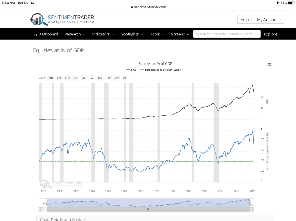
Let’s unpack this to really understand what this means. Ok, the top black line is the value of US Equities (SPX). The grey vertical bars are periods when the US economy is in recession. The right side of the chart will soon show a thin grey bar in 2020 as we have clearly been in recession since March. The blue line is the equity markets as a percentage of GDP which has very recently done something it has never done. The blue line hit 1 or the equivalent of 100% of GDP.
Economic historians and students of market history know that rarely do financial markets reach this zenith of valuation relative to the broad state of the economy. More typically we operate within a condition where equities in aggregate represent 70% of GDP on the high side (Red line) or 40% on the low side (green line).
You’ll notice that we have been above the red line a few times in the post-WWII world. Equities were above 70% of GDP for most of the ’60s but market people know that the US stock market actually peaked in 1965 and didn’t make a new high until 1982. What happened during that period? Massive inflation! Hmmmm, the plot thickens. By 1982 as you can see in the chart, equity valuations had dropped close to 20% of the current GDP as stock prices chopped through a series of rolling bear markets.
Then, after nearly 20 years of a raging bull, by the year 2000, stock prices had again pushed out beyond the 70% of GDP mark with the dot.com bubble. But again, prices didn’t stay there for long and it took 13 years for the US stock market to make another sustained new high.
Here’s the disturbing part. Since 2015, equity valuations have remained above 70% of GDP and have just recently pushed to the highest level in US history (as a percent of GDP). What we must all understand is that the financial markets have been unhinged from the real economy for the last 5 years. It has done so on the back of some impressive financial engineering, massive corporate share buybacks, and yes, our own Fed serially supporting stock prices with Federal stimulus and easy monetary policy. In the end, we are left with an equity market that looks at the economy, GDP, and earnings as just a distant, second cousin and not really close family. Are we even related?
History will prove that equities cannot unhinge from GDP like this indefinitely and we are already long overdue for a lengthy period of time when equities fall back into the reasonable range or even a true historic discount to GDP. An inflationary period with a falling US dollar, rising commodities, and rising interest rates would get us there. A period where the growth side of the market weighs down the likes of the S&P 500 while Value finds new leadership would get us there. A long period where internationals take market share from global investors would get us there. This is what we have been talking about for months.
What’s the point?
Once again, this update offers a constructive reminder to all investors who may be too confident in the future of their index-based investments like a Vanguard S&P 500 fund. To own an index now, passively, you’ve got to understand the historical context of where equities sit now as a percent of GDP. You’ve got to be clear and honest with yourself about the prospects of returns looking forward with this strategy. As the chart indicates clearly, the prospects are thin with plenty of downside in the years to come for the likes of the S&P 500. There will be a time to load up on a market index and just sit on it. This is not that time.
Conversely, we feel strongly with high conviction that this is not a time to be passive with index investing, but rather a time to embrace unconventional active investment strategies, those with the will and capacity to own new market leadership that could benefit from an inflationary environment. As we draw closer to 2021/22, you should be clear about your risk management strategy, check your brake pads, and know exactly where to find the exit door. This is the time to review your holdings and position sizes, maybe take some profits, rebalance, reach for higher-yielding/ low price securities as they start trending up, and avoid chasing yesterday’s winner that trade at obscene multiples. Make no mistake, this is that time.
As always, we’re here to help including reviewing any outside accounts where we can run your holdings through our Riskalyze software. We can show you where you are exposed to market risk, run simulations against different market environments, highlight your true sector weightings, look at tax-loss harvesting /etc. We’re here to help, just ask.
Sincerely,
Sam Jones