Adventures in Parenting – Lessons I Learned Helping My Teens Invest
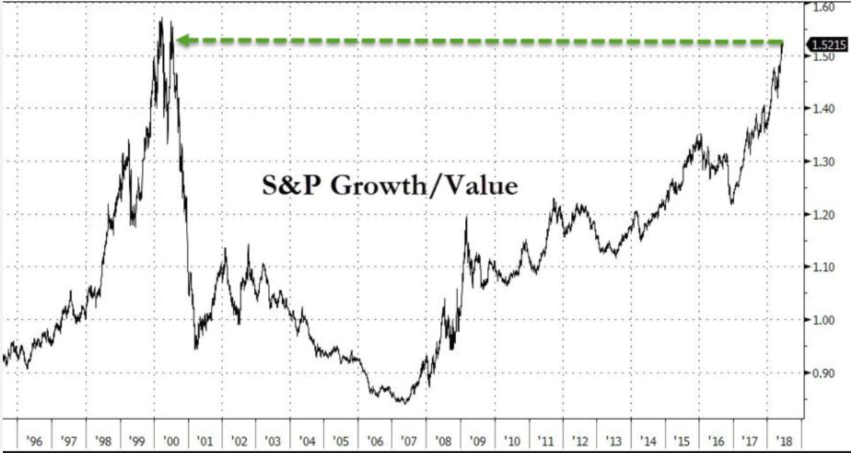
You might skip this update if you don’t have teens in the house or are not interested in teaching your children about investing (at any age). But, under the hood, you might also find some insights related to more signs of extremes in current market conditions.
Cooper’s First Investment Account
My son’s name is Cooper, he will be 17 in a few weeks.He’s a smart kid and has shown an interest in investments. In fact, almost by dumb luck, he won his high school investing contest by purchasing S&P 500 futures at the very lows in 2015. He doesn’t know what a futures contract is but liked the idea of buying “the market” with just some of his pretend money and using leverage. He has a colorful certificate in his room now.Cooper got a job this summer making sandwiches for a sub shop. He made a few thousand dollars and I made him a deal to encourage saving and good financial behavior. I said that he could put whatever amount he wanted into an investment account from his summer earnings and I would match that amount dollar for dollar. I am a good dad! He chose $500 and we opened an UTMA (custodial) account at Fidelity for $1000 with my match with very little trouble.
Tip – You can’t open any other type of account than UGMA or UTMA accounts for anyone under 18. In effect, the parent is setting up the account but the money becomes the property of the minor at age 18.
Another Tip – No one under 18 can be set up to access their account on-line. You, the parent must own and be responsible for the whole thing (trading, reports, etc).
So now, we have an UTMA with $1000 sitting in something called a Fidelity Government Money Market fund earning 1.87%/ year. Not bad.We talked about that. Cooper asked why he should put “his” money at risk when he could get almost 2% doing nothing with no risk. You know the answer. I told him that he could make more than that and he should shoot for something closer to 8%-10% on all of his investments over time at his age.
“But dad, everything I hear and see makes it sound like things are going to get bad soon, I don’t want to lose my money”. Smart kid.Welcome to investing as that fear is valid and forever present.
So we start to put together a no-cost (free to trade ETFS at Fidelity Retail) portfolio of low cost ETFs using our own percentage based formula for stocks, bonds, commodities, etc.Now remember, we only have $1000 to work with.
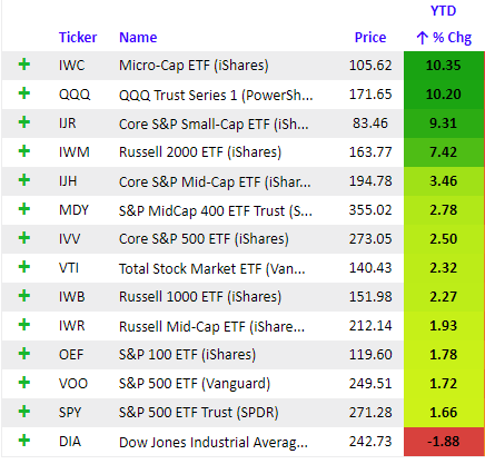
Very quickly, we realized that even the most basic of indexed ETFs are by price alone almost unaffordable. I’ll give you a few examples.
IVW – Ishares S&P Growth ETF $178/share
IVV – Ishares Core S&P 500 ETF $292/share
IJS – Ishares Small Cap Value ETF $170/share
IJK – Ishares Mid Cap Growth ETF $237/share
Wait a second…. What about bonds?
AGG – Barclays Aggregate bond ETF $105/share
Hmmmm……..
As it turns out, if one is a first time investors like anyone who is just starting out with a small balance, you can’t really put together a diversified portfolio with anything less than say $5000.
A few of Cooper’s friends are talking at lunch about stocks as well. Cooper said they don’t have $1000 to invest but they are talking about stocks like Amazon ($1989/share), Netflix ($368/share), Spotify ($181/share) and things they know as modern consumers. They should be looking at things like Snapchat now that it’s down to $9/share but they all hate Snapchat now. Clearly, they haven’t done the math yet based purely on price/share and affordability.
Tip – Investors really should not invest in individual stocks until they have at least $50,000 to work with. New investors, stick with low cost ETFs until then.
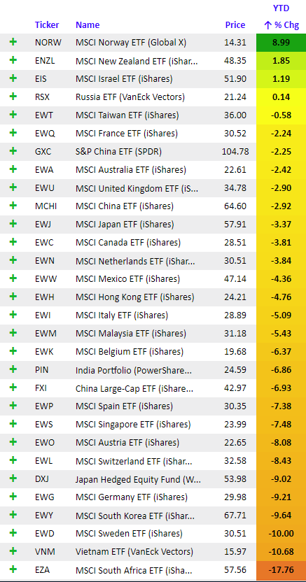
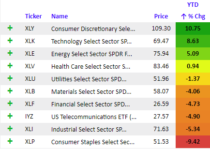
What we did find affordable, purely on a price basis, were a few sector oriented things and a bunch of internationals, especially emerging markets. You know we are focused on this area for our managed portfolios as the best growth opportunities globally trading at significant discounts.
In the end, we finally put together a portfolio of 14 ETFs to create a diversified, global but growthy blend of securities that he wouldn’t have to think much about. In some cases, he will in fact only buy 1-2 shares. It wasn’t easy as price/share became a bit determinant of what we could own. Our plan is to pick off pieces of this portfolio as they present opportunities to buy which is why his account is still sitting 100% in money markets. We might buy some internationals next week.
High price Implications of today’s market
No one should really factor in the actual price/share of a security when making an investment decision – unless you’re 17 and only have $1000 we discovered!
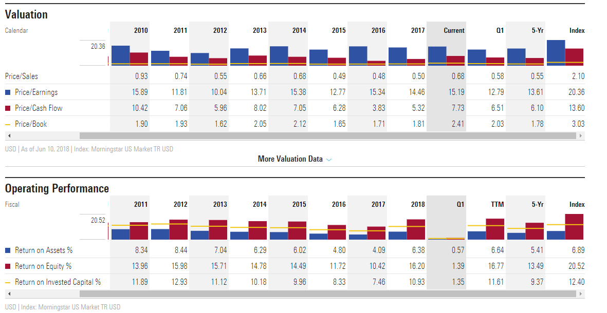
Price/share means very little as some highly priced companies are actually cheap relative to their earnings. In the academic world, the price we are willing to pay for shares of a company, should be justifiable as a discounted measure of future free cash flow. But, the fact that the entry fee (aka price) to buy practically anything in the financial markets after nine full years of rising prices should nag at your sense of the future
This market ain’t cheap on many measures, just ask a 17 year old first time investor.
Teach What Matters
There are may different models for how parents try to teach their kids about money. Strangely, there seems to be a strong focus on building credit, presumably so they can go out and accumulate great gobs of personal, school and home debt. Oops, I tipped my hand. Teaching our kids should not start with credit or how to live under the burden of borrowed money. Somewhere, somehow, the lending world twisted our realities into believing that we cannot exist without debt. We can, it just requires a different set of standards. Let’s dive into that.
Delayed gratification
I can see you nodding. We need to teach this first but how? Children and adults want everything now whether they can afford it or not. And offering credit to an uncreditworthy person as a means of buying something NOW is just greasing the skids toward insolvency. Sadly, in that Puritanical way, the best lesson we can teach is about delaying the purchase until you can afford it. As parents, it’s hard. We want our kids to be happy. We want to give them what they want now and it’s hard to say no. So how do we teach delayed gratification gracefully. I think there is a lot of good lessons in providing a financial budget for a young person. That means giving them some money on a monthly basis if you can.
*Note some kids are great at earning real incomes during the school year and paying for everything themselves. That is awesome! But lots of teens don’t make enough in the summer to pay for much.
The monthly budget does a number of things. They learn to live within a monthly budget. Keep it real. We put $100/ month into a teen checking account for our 17 year old and he has a debit card. With a debit card, he can’t spend more than he has. He has to use that budget to pay for everything himself. He spends $65 of it on gas, which means he has to be careful not to drive too much. If he goes out to lunch everyday at school, he’ll burn it all. If he wants to go to a concert with his friends, he’d better save for a month or two. If he wants things that cost more than $100/month, he’ll start looking for a paying job during the school year. After about 6 months of this, Cooper now checks his account balance every week.He knows what he has available.He has to wait until his next $100 infusion to get “stuff”. We are teaching delayed gratification. Along those lines, I would strongly recommend against providing your teen with an open ended credit card. That teaches dependence and a life built on debt. Don’t do it.
Turn Savings Into Investing
Circle back to the original offer. You’ll need to provide them with an incentive to save.Try the matching thing for any money they save from summer jobs. Turn “savings” into “investing” by putting the money in an account that is difficult or impossible to access (like a Custodial account at Fidelity). They are smart enough to recognize that a savings account at the bank is ready cash so you really need to make savings more of a long term commitment. Get them involved in security selection and building a portfolio. Have them experience joy and pain with the outcome. The critical point here is not about handing them money, it’s about teaching them what to do with money and how it can grow over time if they pay attention.
Self-Reliance
Along those lines, I see many parents who try to hold the line on not giving their kids any money until after college or something like that. The thinking goes that a teen is not responsible enough to do such a thing.Well, I’m going a different route.I think our country is financially illiterate and that is the root cause of our great bust cycles in the last decade.The next generation must break this destructive mold and we need to teach our kids about money at a much earlier age than past generations. I would rather have my kid make mistakes with $1000, than with $100,000, right.Teaching them about money is really a daily and weekly grind. We need to talk them through decisions they are making, spend time with them weekly going over their investments. We need to give them enough money that they take it seriously early in life. How young? I would say around 15 or 16 is the right age.
If we as parents spend the time teaching our kids, there will be two benefits. The first is that they will have a lifetime skill that they can leverage as they begin their working years. I tell my kids, your money should be working as hard as you do. The second is that they will accumulate a reasonable nest egg to launch themselves post college. They will have the satisfaction of having saved, earned and accumulated something that they can use to pay rent, buy a car, even a house. There is pride in that for them in being independent and doing it themselves. I would suggest you get started while they are young and teach them to be financially self-reliant.
That’s all I’ve figured out as a parent so far and I’m sure there are plenty of other ideas or plans that work. Feel free to shoot them over and I’ll post them the next time we get into this subject. Best of luck to all with your own adventures in parenting.
Cheers!
Sam Jones


